First I must say that this was one of the most intense art projects I've ever done. And I'm sorry to say I do not have a back cover because I ran out of time to make one but I do have 9 pages and a cover pages so that should count for something. Anyways the tools and skills that I've learned from this intense experience is now the lasso tool is my best friend. With all the crazy coloring the lasso tool helps me stay within the lines. I use that tool the most. I also learned how to create anchor points and stroke a path using the pen tool combined with the brush tool to make my line art for this book. That was pretty time consuming. Some pages took me hours to do and I was only lining them. But the pen tool, brush tool and lasso tool are the tools I used for this project and I'm now very well aquatinted with them.
About being on a production line, I definitely learned that I need to time myself better. I ran out of time on this and was pulling all nighters which was very bad for me. But I know now that I need to have a better schedule and sit down and just do it for a couple hours, take a break, then come back, because staring at a computer screen for 24 hours straight isn't good on the eyes or neck. I will definitely improve in the future.
I'm not quite sure what I plan to do with my book right now. I might come back to it and fine tune the coloring or maybe color ti in a different way with skills that I might acquire in the future. For now it shall sit on this blog and on my computer. I don't plan to print it since I don't think it's really worth it. I didn't spend the amount of time I wanted to on it so I'm not perfectly pleased with it but I'm still pleased I got out what I got and it still looks quite decent. Maybe when I print it it might become the next children's favorite, but until then I shall think of better ways to revise it.
Monday, December 5, 2011


Tuesday, November 15, 2011
Poster Reflective Essay
I chose the theme of movie poster because to me it seemed more eye catching and easier to do. I tried to make up a movie but had no luck with the amount of time I had and the ideas I wanted to convey so I picked two movies that were already out there. The first one was Black Swan and surprisingly it had a couple posters made for it already that weren't the original movie poster design. I had a hard time making sure I didn't copy them, but I believe I did a pretty good job. The second one was Spiderman because I thought I could do something cool with a spiderweb in it and I think it turned out pretty good as well.
The main tool I used for these two posters was the masking tool. At first I planned on making everything from scratch with the shape and pen tools but decided that would take to long and since I'm kind of an OCD freak I wouldn't have it finished in time for the due date so I decided to mask the main characters front he movies and then put a solid color overlay on them. The Spiderman one I did all gradient overlays and the Black Swan one I did all solid color overlays. It turned out pretty well except for the fact that I'm really OCD so I took a very long time making sure the edges were perfect with the picture. Doing the solid colors to me made it more dynamic and abstract. I didn't want to have any part of their faces or outfits showing but at least have the main outline so you still knew what it was.
One of the main compositional components I did was symmetry with a little abstract in the Black Swan poster. The dancers and the swan are all perfectly symmetrical with each other but to add the abstract I put in the red feathers in random descending order to show the sort of chaos I guess of the movie and the fact that their red as opposed to all the black and white and grey draws the audience's attention towards them and makes the poster pop a little more. The Spiderman poster was suppose to be sort of abstract but I sort of got a little lazy with the the placement of the figures and name. That was the poster I'm not the most proud of because I ran out of ideas in the amount of time I had for cool effects.
Monday, November 14, 2011

Sunday, November 13, 2011

Friday, November 4, 2011
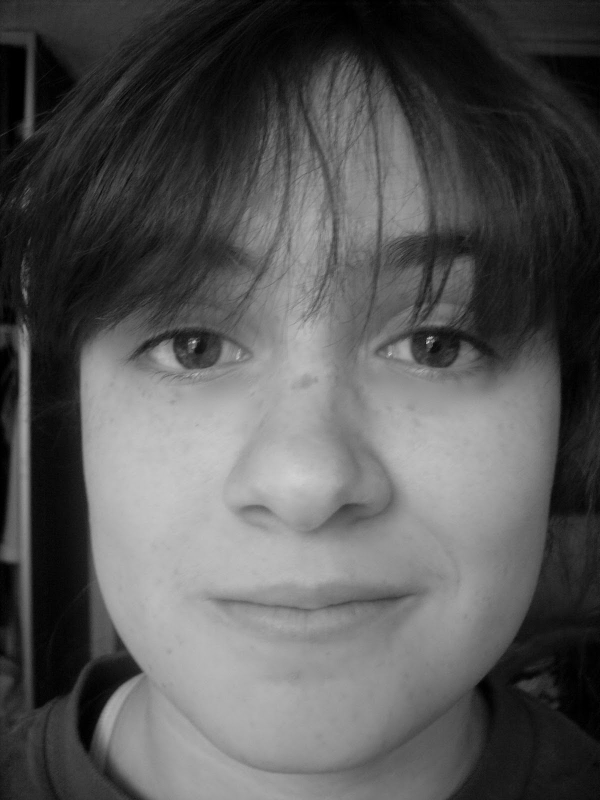
Portraiture Reflective Essay
I believe that participating in a global project is exciting. Knowing that something small as one contribution to a huge collection can make a difference in the world. Knowing the background of the project by watching the video about how it started is also very exciting because you know it worked if it’s still going on.
The people I used in this project were myself, and my two friends Shannon and Taylor. When I asked them if I could take a picture of their face the first reaction was “Can you take away my acne?” and I was like “Of course so is it a deal?” And they accepted. First they didn’t now how close I was going to get to their faces and if they were suppose to smile or not. I told them to make a strong face of something they believed in and at first they didn’t know what I was talking about so I told them to just smile. The pictures still turned out great. I used photoshop to take away their acne like I promised and the lines under their eyes so they look young and awake. Other than using black and white afterwards there wasn’t any major changes. It took me awhile to get a picture of myself since I was alone but after about 20 pictures I got a good one.
I believe very strongly that art can change the world. Art is what everyone sees on a daily basis. Art isn’t just painting and drawing. Posters and advertisements are art as well and people are swayed by what they see in the media. So yes art can change the world if you get enough people to look at it.

Wednesday, November 2, 2011

Tuesday, November 1, 2011
Photomontage Reflective Essay
I acutally used six images instead of just four because I was originally only going to use four until I started adding a couple and a whole new world started creating itself in my head so I added two more pictures to round it off. All my images are snagged from the internet. At first I really had no idea what I was going to do or what pictures I was planning to use but I knew I wanted some sort of scenary in it so I started with the mountain reflection picture which I took from http://desktopwallpaper-s.com/42/-/Norway_Mountains/ . Then I decided to have a whole different background but in space since it seemed like a cool concept so I looked up pictures of space and pulled the sweet background you see on almost every new mac model from this site http://www.coolwallpaperslk.com/2011/03/space-hd-wallpapers.html . Then I didn't know what to put in it but the mountain was floating so I decided to put some sort of flying thing in there so that's where the airplane came in which I snagged from http://www.loc.gov/pictures/ . Then I decided to through an animal in there and thus the eagle takes form and came from http://www.squidoo.com/bald-eagles-?utm_source=google&utm_medium=imgres&utm_campaign=framebuster . Then when I saw that these two melded together I decided to put something on the other side but with ground transportation so I got the horse from http://www.whitegadget.com/pc-wallpapers/141792-horse.html and the car from http://www.carinsurancecomparison.com/minimum-car-insurance/
The most challenging thing for me when putting the images together was finding a way to blend them so they all kind of looked as if they sort of belonged in the picture. I played around with different lighting and textures and finally came to consenses of putting all the small pictures in luminasity and the background in pin light. The mountains remained the same. It was tedious when I was masking the the smaller pictures and the mountain so that their backgrounds didn't show but I got it done and it wasn't terribly difficult.
The story I guess I'm trying to convey here in this photomontage is that there use to just be nature in the world before humans and electronics and those kinds of modes of transportaion but now they're just a refection to today's society. I thought the mountains and space could tie it all together and make it look like a different world.

Monday, October 24, 2011
Erasure Reflective Essay
One of my favorite images from the erasure project is the one from the National Geographic, October 1998 with the man in the middle of the forest up the tree. At first I was going to take out the tree and have him floating there but I realized I kind of did that for the woman on the mountain so I decided I should just take out the guy and his pole instead.
I thought removing the guy and the pole wouldn’t be too hard but I was sadly mistaken. I used the clone stamp for this entire process, cloning every little leaf I could find and meshing them together over the man’s figure to make a very convincing bush. I would normally use the blend tool to help but with the leaves being so distinct I didn’t want to risk it looking like I obviously removed something that was clearly on top of the bush. I’m glad with the final result of that picture because I showed it to my friend and she didn’t know what was missing from the picture before she saw the original.
For all the images in the erasure project I used the clone stamp quite frequently. It is a very useful tool in removing something but still wanting the original background to be there. I used the blend and healing pen a lot on the image of the guy putting up the missing phone number posters. I also used it a lot in the mountain climber in the clouds picture. Other then that it was mainly the clone stamp tool throughout all the images.
I believe I did when it came to the finer details. I’m very OCD and I didn’t want any of the images to look as if something was obviously taken out if you hadn’t already seen the original. I made sure to make everything perfect. I don’t know if that counts as a critical perceptive, but I did critique myself until it was perfect.


Sunday, October 23, 2011


Sunday, October 16, 2011
Scratch Reflective Essay
When working on this at first I had no idea of what to do. I started out doing the collaboration “Triangle Madness” because my instructor said it should look geometric but then I branched out to forming my own shapes from previous ones such as triangles, rectangles, and circles.
Working with flat color was really boring at first. There’s no real depth to it, but as I kept working with it I realized I could do a lot that I didn’t know I could by just changing the colors slightly to create a sort of depth. With the color choices I had it was pretty straight forward on the “Leap of Faith” picture. That one was depicting a specific scene so blue sky was necessary and a brown building so no real complications with color on that collaboration. The “Triangle Madness” picture was kind of weird. I originally had four colors in it consisting of red, orange, blue, and green, but than I started using opacity and lighting and darkening certain triangles. All of a sudden new colors were coming in. I don’t know if my colors go well together, and they probably don’t, but it was quite interesting to experiment with the color lightings and making certain ones negative and dissolve and luminescent. With the “Dessert Time” picture the colors were pretty straight forward on what each dessert was but when it came to the background I got a little crazy with different shades of pink and opacity of each circle. I felt like it needed to be cute looking since all the desserts were pretty cute themselves.


Wednesday, October 12, 2011

Monday, October 10, 2011
Reflective Essay on Type
When I created my first collaboration of the A Butterfly I didn’t really think of a lot of scale. I was more into having everything symmetrical since I’m kind of OCD like that, but as I progressed and listen in the lectures I started to scale my letters really big as you can see in Stacked I’s and O Bubbles and they weren’t all fully visible in the picture. So to sum that up I’d have to say that as the pictures progressed the scale got more extreme.
The O attracted me the most since it was such a simple shape. I could have made it anything, but I decided to keep it’s original shape in the form of a bubble in the picture O Bubbles. But like I said before I could have made it anything so I put a bunch of O’s together to create a bubble wand to imply that there were bubbles in the pictures and not just floating O’s.
At first when I was working with layers in photoshop it was all new to me and I didn’t want to have to many layers or I was afraid I’d overwhelm myself, but I found it was much easier to duplicate layers so I didn’t have to create something totally new. This definitely helped with the A Butterfly when I wanted everything to be symmetrical so I didn’t have to scale everything exactly. It also helped in Neon Z’s when I wanted three sets of same sized letters.


Subscribe to:
Posts (Atom)